Personal Portrait
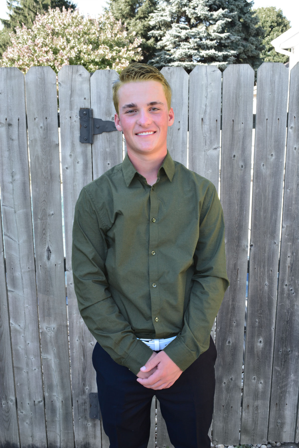
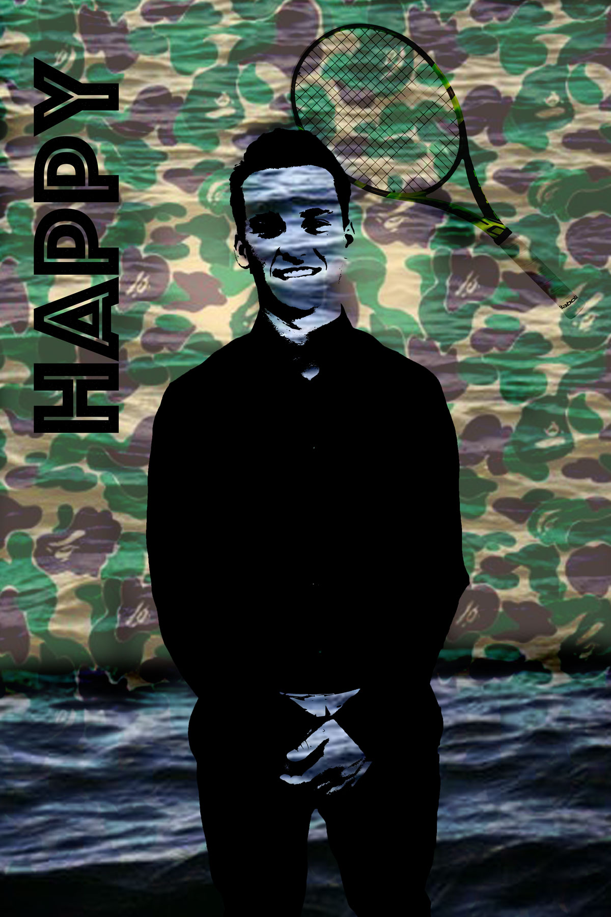
In this poject we took a picture of ourself and edited it using photoshop. For the first image I changed the color of my hair and shirt. I also whitened my teeth as well as brought the brightness out of the background to make myslef stand out. For the next image we took 4 images and put them together in a collage.
What Is The Difference
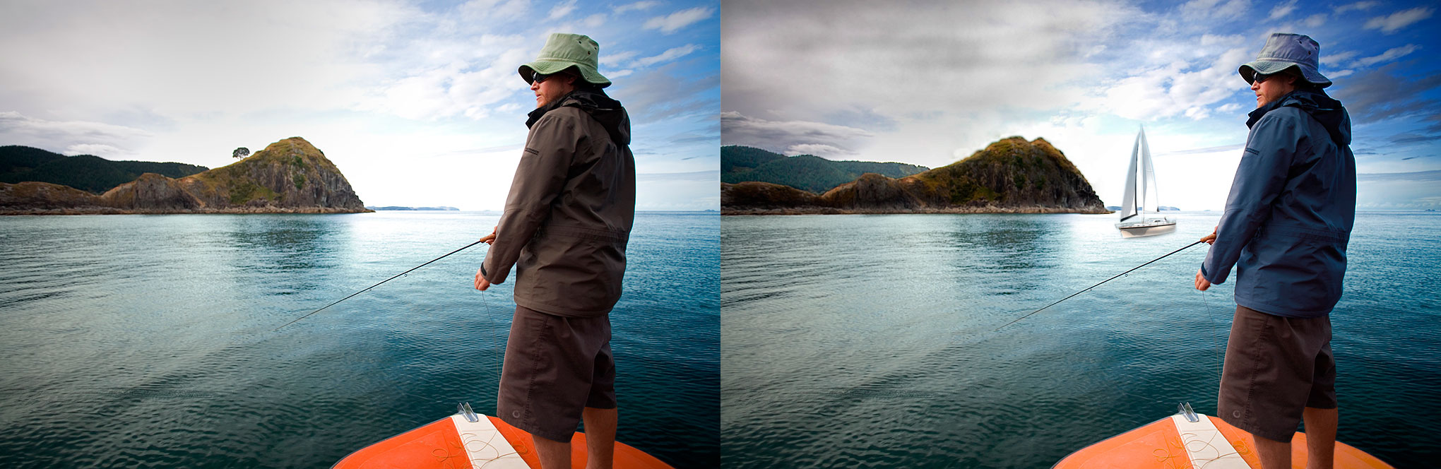
- I lightened the color of the sky to be a bit darker, by selecting the sky and putting a curves adjustment layer on it. This created more contrast with the clouds.
- I selected the hat the man was wearing and I added a selective color adjustment layer. I set it on neutral and changed the levels to turn the hat blue.
- I added a sailboat in the lake. I took a seperate picture and added it to the main picture. Then I selected the boat and added a vector which took away the background. Then I blurred the bottom of the boat and the water.
- On top of the mountain I deleted the tree by using the content aware tool and then using the spot healing brush.
- I extended the mountain to the right by using the content aware tool. Then I used an adjustment layer to brighten the mountain to make it look similar to the rest.
- I lightened the forest behind the mountain by using the brightness adjustment tool.
- I changed the color of the man's jacket to a dark blue to match his light blue hatt. I did this by selecting it and adding a selective color adjustment layer.
- I lightened the orange boat the man was on by using the levels adjustment layer.
- I used the dodge and burn tool, set on shadows to darken the mountains.
- I used the burn tool to gives the clouds above the mountains a darker look.
Chimera
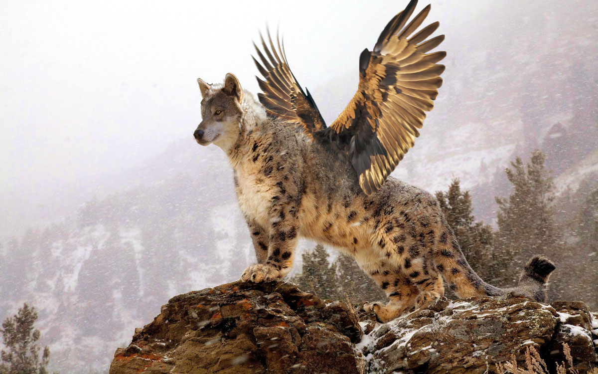
The purpose of this project was to learn how to merge things together. The main thing I had to do was blending and color adjusting. The most difficult thing was trying to find pictures that were in the same position and fit well together, however this made it easier to edit. I change the wolfs head, it it see through at parts. I really enjoyed being able to do whatever animals I wanted too.
Environmental Poster
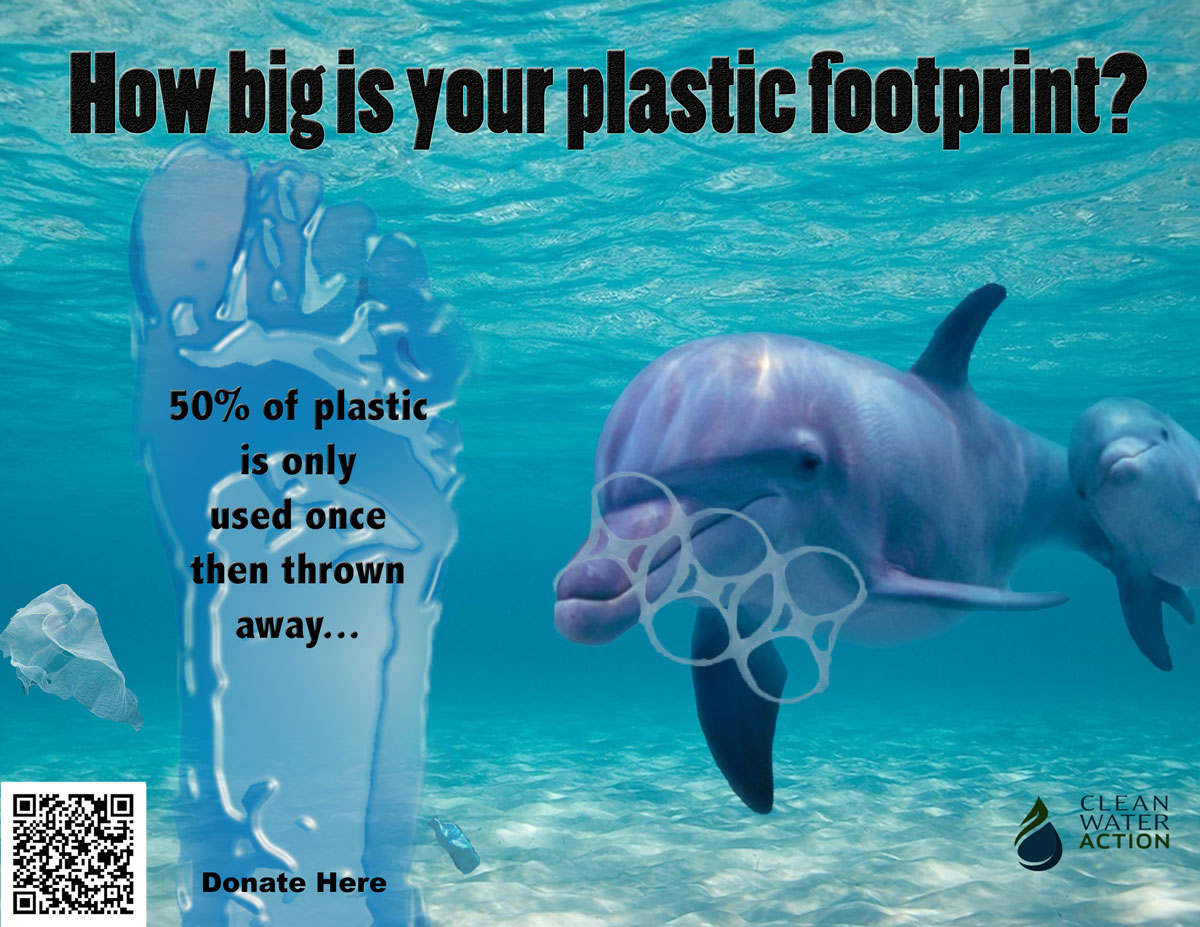
In this environmental poster my main purpose was to show the problem of plastic in the ocean and it's consequences.
The separate pictures on the poster are the dolphin, the plastic bag, the water bottle, the six pack plastic, and the ocean background, as well as the plastic foot. When I brought the dolphin over it was a darker color so I used a curves and selective color adjustment layer to adjust the color of the dolphin to be more consistent with the waters. Then I blended the edges of the dolphin because there was a unnatural green line around it. To adjust the colors of the plastic bottle and bag I used a selective color adjustment layer on both to make them both lighter and more blue. Then I lowered the opacity on both. The hardest to make look real was the six pack plastic. To make it fit in better I used a selective color, brightness/contrast, and a color balance adjustment layer to try and make it look real. However with a poor picture and wrong shadows this was difficult, and if I had to change one thing, it would be a better piece of plastic around the dolphins nose. For the plastic foot itself, I took a real picture of a foot and put a filter>filter gallery>plastic wrap on it. Then I put a selective color adjustment layer to make it more blue. For the background itself, I didn't change anything about it.
The separate pictures on the poster are the dolphin, the plastic bag, the water bottle, the six pack plastic, and the ocean background, as well as the plastic foot. When I brought the dolphin over it was a darker color so I used a curves and selective color adjustment layer to adjust the color of the dolphin to be more consistent with the waters. Then I blended the edges of the dolphin because there was a unnatural green line around it. To adjust the colors of the plastic bottle and bag I used a selective color adjustment layer on both to make them both lighter and more blue. Then I lowered the opacity on both. The hardest to make look real was the six pack plastic. To make it fit in better I used a selective color, brightness/contrast, and a color balance adjustment layer to try and make it look real. However with a poor picture and wrong shadows this was difficult, and if I had to change one thing, it would be a better piece of plastic around the dolphins nose. For the plastic foot itself, I took a real picture of a foot and put a filter>filter gallery>plastic wrap on it. Then I put a selective color adjustment layer to make it more blue. For the background itself, I didn't change anything about it.
